360i Brand Refresh
As ad agency 360i grew in notoriety and become recognized as a leading digital agency, a decision was made to modernize the branding to reflect the very principles that got them there: 1. Simplify the complex 2. Adapt to change.
To address this brief, we eliminated superfluous components from the old logo, streamlining it to reflect a new simplicity. Now a silhouette, the logo affords supreme adaptability, never losing it’s true identity while opening up infinite creative possibilities.

Old logo on the left, minus non-essentials in the center, yields a streamlined logo on the right.

A color trends study helps decide a color palette that is both contemporary and relevant.

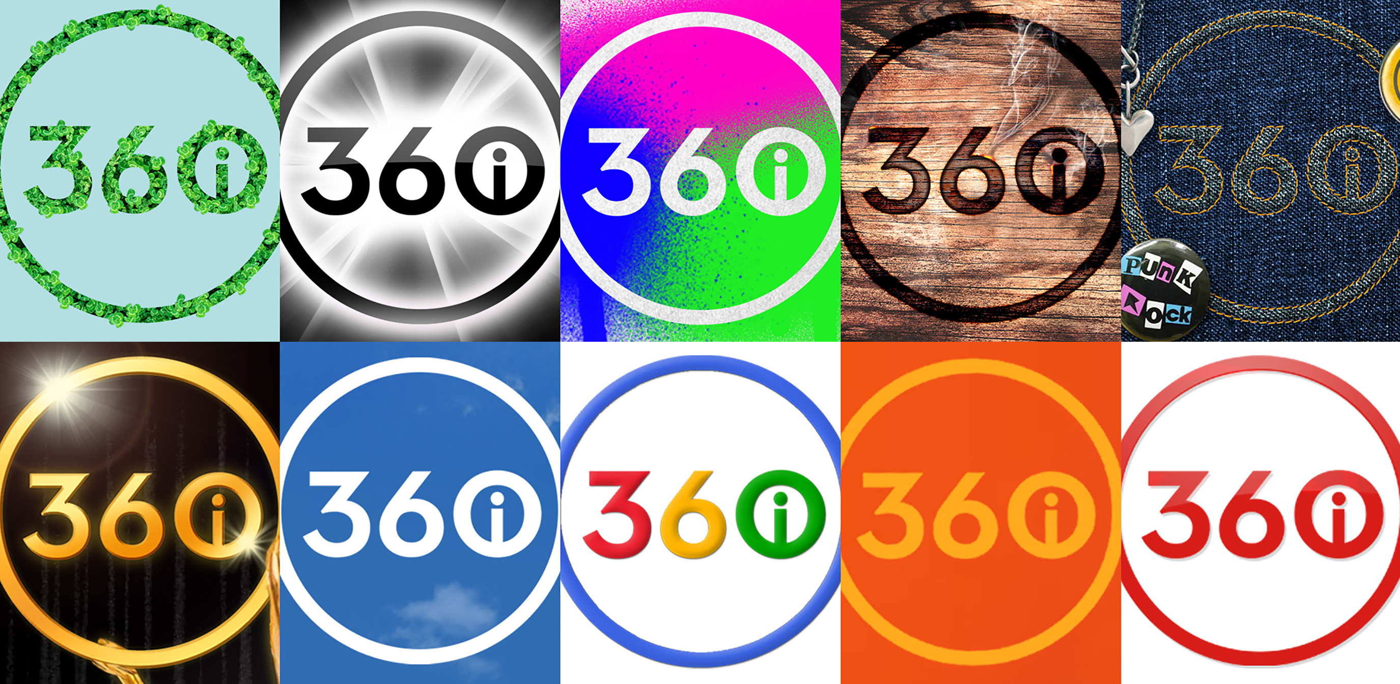
Color proofs of concept.
![]()
Brand guidelines demonstrate how 360i can easily adapt to the palette of other brands with whom they partner.
![]()
Excerpt from brand guidelines defining logo usage.

Tangential brand elements such as 360iU also benefit from easy adaptability.

An iconographic system makes for quick visual associations reflecting the principle “simplify the complex.”

A fresh new look also serves as a strong recruiting tool.